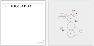
Experimenting with square layouts
To begin with, I was unsure with what size/format to go for with my designs. I wanted to look at working with different formats to what I usually go for, and therefore looked at the possibility of using square layouts.
Although I feel that these layouts had potential, when designing them, I really struggled to fill the space. I found it difficult to get the right mixture of image and text that compliment the simplicity of the diagrams, which would have led to a lot of white space.
Experimenting with A5 layouts
A5 seemed a suitable format for my content. As the manual is intended to be used often, a compact size seemed ideal. It is mainly a reference book therefore it's content is important and size shouldn't jeopardise this.
I wanted to make sure that the diagrams and images were separate from the content so that everything was legible, and not too cluttered. I didn't want to be afraid of the white space when it came to placing the body copy, however by adding the monotone image, a hint of colour is added, breaking it up.
Creating a final A5 grid
After experimenting with possibilities on an A5 layout, it was imperative to create a grid to work to.
Fitting pieces into the grid
I had it in my mind that during this brief I wanted to experiment with using a serif typeface, not only for readability, but I continuously use sans-serif, and I wanted to break this mould.
I decided to work in a typeface named 'Justus' which would allow me to work in, which is a classic serif type, that works not only as a header, but was readable as body copy. It works extremely well for subheadings and tags as it can be used in oldstyle, roman, bold etc.
Serif
Sans-serif
Deciding on left or centre alignment


No comments:
Post a Comment