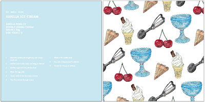
Now I'd experimented with my pattern, I could begin applying to my publication. Initially, I was unsure on format, and therefore decided to experiment with standard A4 to start off the process.
When putting my layout together, I needed to remember that my book is solving the problem of minimising mess. I therefore wanted to make sure that there was plenty of white space around the text within the publication, so that any baking products on the readers hands and fingers will not disrupt the content.
A4 recipe book development
Edmondsans was the chosen typeface for this project. I felt that it was contemporary, suited my illustration and it also allowed me to work across bold, medium and regular formats, which are definitely needed in terms of applying this to an app and recipe book.
I felt that an A4 paper size could possibly be slightly boring and standard, however, and therefore started looking at the possibility of using a square.
Square recipe book development - 10 x 10in format
I then moved on to putting the above content into a 10 x 10inch layout. The content allows the reader to see how complicated the recipe is, how much it will serve, and how long it will take them. As well as this, it also displays the ingredients and steps in simple terms so that it appeals to the audience of amateur bakers.
Here the larger pattern has been used to see how it would look within the publication.
Adding colour
I then looked at the possibility of adding colour to the pages to see whether or not this would be effective. I felt that it worked for some pages, however, on others it just didn't look quite right.
Evidently, by just using one solid colour, that colour wasn't going to go with each pattern as a number of different colours had been used throughout. I therefore considered picking two main colours and applying this to the publication. It wasn't successful as it made the book look extremely busy, and the colours were pretty garish.
Simple colour
From this, I needed to consider how I could apply colour in a much more subtle and simplistic manner, so that I could use a range that would suit each publication. Below is how I have decided to use colour within my recipe book. I believe it is effective, and allows me draw focus to the recipe title.


joya shoes 756h1ldewa729 joya sko,joya sko,joya skor,Cipő joya,zapatos joya,joya schoenen verkooppunten,Scarpe joya,chaussures joya,joya schuhe wien,joya schuhe joya shoes 625u7ydmgf301
ReplyDelete