The task set in the typography workshop was to initially choose a sans serif typeface. The original typeface I had chosen was picked by someone else, leaving me with 'Helvetica'. Although slightly reluctant, with Helvetica being such a commonly used typeface, I decided to give it a go.
Background information
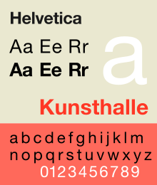
Helvetica is a widely used sans-serif typeface developed in 1957 by Swiss typeface designer Max Miedinger with Eduard Hoffmann.
Helvetica was developed in 1957 by Max Miedinger with Eduard Hoffmann at the Haas'sche Schriftgiesserei (Haas Type Foundry) of Münchenstein, Switzerland. Haas set out to design a new sans-serif typeface that could compete with the successful Akzidenz-Grotesk in the Swiss market. Originally called Neue Haas Grotesk, its design was based on Schelter-Grotesk and Haas’ Normal Grotesk. The aim of the new design was to create a neutral typeface that had great clarity, no intrinsic meaning in its form, and could be used on a wide variety of signage.
When Linotype adopted Neue Haas Grotesk (which was never planned to be a full range of mechanical and hot-metal typefaces) its design was reworked. After the success of Univers, Arthur Ritzel of Stempel redesigned Neue Haas Grotesk into a larger family.
In 1960, the typeface's name was changed by Haas' German parent company Stempel to Helvetica in order to make it more marketable internationally. It was initially suggested that the type be called 'Helvetia' which is the original Latin name for Switzerland. This was ignored by Eduard Hoffmann as he decided it wouldn't be appropriate to name a type after a country. He then decided on 'Helvetica' as this meant 'Swiss' as opposed to 'Switzerland'.
Category: sans-serif
Classification: Neo-grotesquie sans-serif
Designer(s): Max Miedinger, Eduard Hoffmann
Foundry: Haas Typefoundry
Date released: 1957
Re-issuing foundries: Mergenthaler Linotype Company
Design based on: Akzidenz Grotesk
Variations: Helvetica Neue, Swiss 721 B, Helvetica World
wiki
Characteristics
wiki
Characteristics
Arial (blue) vs. Helvetica (red)
Information from: http://designrfix.com/fonts/arial-helvetica
Different strokes
I always think that the lowercase a is one of the easiest giveaways between Arial and Helvetica. First notice that Helvetica has a tail at the finial, firmly anchoring the letter and completing the flow of the stem, whereas Arial is cut off at the baseline, making the a appear less stable. The terminal of Helvetica ends at a horizontal, which helps complete the letter. Arial on the other hand looks a bit clumsier, with the terminal ending at an arbitrary angle. Also notice how the bowl meets the stem with a pleasing curve on Helvetica, making the letter look fuller. This same joint on Arial looks disjunct.
Notice in Helvetica how the terminals and finials of f, r, and t all end in perpendicular horizontal and vertical lines, whereas they’re all angled in Arial. But what’s even more jarring, is that the Arial terminals of these three letters all end with different angles. Where’s the rhyme and reason? Furthermore, notice in Helvetica how the terminal of the f and the finial of the t end at the same vertical line as their respective crossbars. In contrast, the f terminal and t finial both overshoot the crossbar in Arial. Helvetica demonstrates in these three letters exactly how thoughtfully designed it is. It’s uniform, tight, and structurally sound by adhering to a guide of verticals and horizontals. The lack of uniformity in Arial makes it seem less succinct when the font is composed as a whole.
You can observe that Helvetica continues to adhere to the same perpendicular grid principle in these rounded capital letters as it did with the lowercase letters. The terminals in Helvetica all end at a horizontal, whereas Arial continues with its arbitrary choice in angles. You can see that Arial and Helvetica just have slightly different bowl shapes, but they appear rounder and fuller in Helvetica.
I find the difference between Gs to be especially interesting. It seems as though Helvetica broke their own rules by shaving off the finial of the G at an interesting angle. However, there was reason for this and it was done for the sake of fine design. Imagine if the finial was continued on the vertical line. The joint where the bowl, leg, and finial meet would be very heavy. The concentration of points would be an eyesore and the G would attract too much attention. I also think the addition of the finial was a smart decision, because like the a, it helps ground the letter. The Arial G seems less stable and the bowl feels a bit incomplete.
The tails of the Qs are remarkably different. Arial decided to go with an embellished tail. I find that it brings additional mess to the font as a collection, adding new lines and new angles. Helvetica sticks to the rule of perpendiculars even in the tail of their Q. The Q is a strange glyph overall, but in applying the same principles to it as their other glyphs, Helvetica successfully integrates it with the other glyphs, making the font as a whole more neutral.
The Rs are another easy indicator between the two fonts. With the leg sticking so far out, the letter seems to take up more space than necessary and creates an odd counter. This space can look awkward in text. Moreover, the joint where the leg meets the bowl recedes too far in, making more awkward negative space. The glyph seems off kilter. Helvetica designed the R masterfully. The counters are stable and balanced, and almost parallel one another. As with the a and G, Helvetica effectively utilizes the finial in the R to stabilize the glyph.
Arial continues adding arbitrary angles in its numerals. The ear of the 1 looks unanchored to the stem, as if it’s about to flit away. By making the ear meet the stem at a 90 degree angle, Helvetica’s 1 seems solid. The Helvetica 3 looks more complete and settled than the Arial 3 again because the strokes are completed at flat, perpendicular lines. The Arial 3 looks a bit springy because of its angled terminals. I just want to press the top down a little to straighten the glyph out a bit.
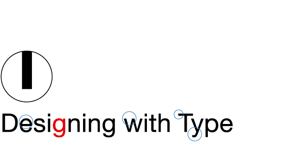
Final design:


No comments:
Post a Comment