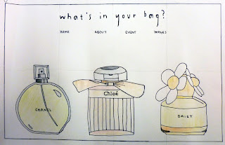
Scamp 1
Scamp 2
Scamp 3
Questions asked
1. Are the layouts too simple? Should they have something more on them?
2. Which one is most effective? Are there any ways it could be improved?
3. Should more information be included on the homepage or would it get too cluttered? Should all information be included elsewhere when other links are followed?
4. Are there any ways in which the designs could be made more fun/interesting for the audience to look at/use?
5. Do they seem easy enough to navigate?
Things to consider when writing questions for feedback
- DO NOT ask for validation
- If you're thinking it, sort it out yourself first
- By suggesting something, people will be influenced by this, and simply agree with you
- Your design should justify your design, not your question
- "Does it work?" - NO!! Define it
Feedback 1
Strengths
- Number one and number three are more interactive because if you click on it 'what is going to happen?!' make its more interesting
- Number three works the best in our opinion because it has an option to be interactive but if you 'can't be bothered' you can see other click options
- Navigation on three seems the best
Areas for improvement
- On number two do you actually click on the illustration? If you don't click on it then why is it there?
- Maybe give number one some options or explanation
Considerations
- Neither of them are too simple. The more simple the clearer to understand and to navigate
- Depending on interactive element, why? What? Purpose? Do you know where you are taking the interaction and is it needed?
Feedback 2
Strengths
- Really like the simplicity of the layouts, visually appealing clean and clear
- Great illustrations would work strong visually using a small pastel colour palette and as vector graphics
Areas for improvement
- How would text be displayed in this layout?
- Scamp two and three are strongest layouts and most functional navigation
Considerations
- Use of typography and layout of body text alongside illustrations will improve context and functionality
- Try to maintain white space and clear layouts when body text is added
Feedback 3
Strengths
- Good illustrations
- Clear and simple web pages
- Links work well - very simple
- Quite a playful website idea
- Good use of colour - try and carry this through to actual website
Areas for improvement
- Not sure about scamp one, harder to understand - not as obvious
- Scamp two - when you see the girl you don't immediately think of perfume
- Could you make the perfumes interactive?
Considerations
- Simple layout works well - easy to understand, clean and fresh
- We like scamp two and three the most, we think that scamp three explains more about the subject. If you were to use the illustration from number two
- There is enough info on the homepages two and three, scamp one is a bit harder to understand what it's about
- Perhaps when you click on the perfume bottles they could spray out perfume or the lid could come off them take you to another page
- Very easy to navigate


No comments:
Post a Comment