- the concept of the golden ratio can be simplified
- the rule of thirds governs the placement of points of interest in a scene
- divide any given image into thirds both horizontally and vertically
- you'll get 9 grids
- according tot he rule of thirds, the vertices of those lines are the ideal placement for points of interest
- people scanning the page are more likely to notice things placed near the focal points and the division is comfortable to view
- more complex design is possible by breaking down those thirds into further thirds
- major images, news boxes, search bars and any other points of interest can be nestled on or near the horizontals
- this little shortcut will give you a design that is both easy on the eyes and makes people drawn to key pieces of information
Canons
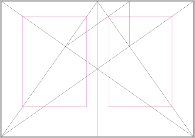
- Van de Graaf canon
- a gridded page is much like scaffolding for a building
- it is a structure that elements can be organised
- a grid will help continuity to be maintained and information digested with flow
- the Van de Graaf canon is a historical reconstruction of a method that may have been used in book design to divide a page in pleasing proportions
- this canon is also known as the secret canon used in many medieval manuscripts and incunabula
- the construction of how to make a Van de Graaf canon works for any page width:height ratio
- creates a symmetrical layout
- where your hands go, doesn't cover up the text
- nothing is out of proportion
- Historian John Man suggest that Gutenberg's Bible page was based on the golden ratio
- octavo format, the text are and margin proportions are determined by the starting page proportions
Creating my own Van de Graaf page on InDesign
Building up a grid
Leading - a brief overview
- column width is more than just design or format
- it is also based on legibility
- printed collateral (text) is read by the eye of a distance of 30-35cm
- according to empirical rule there should be 7 words per line for a text of any length
- to keep the type area light and open we must consider the leading
- i.e. the vertical distance from line to line which suits the size of the type
- overlong text lines tire the eye, as do overshot ones
- readers find overlong lines strenuous to read
- this is because too much energy is spent keeping the horizontal line in sight over a long distance
- too short of a line and your eye changes text lines too often
- wrong column widths lead to time and energy wasted
- a column is easy to read if it is wide enough to fit in average 10 words per line
- the key is ease of reading
- text must not impair the rhythm of reading
- this cannot apply to titles and subtitles
- advertising functions require headings to standout and be absorbed by the eye
- it's function is to sell
- are columns just aesthetic creatures?
Margin proportions
- margins can have a influence on the overall feel of a page of print
- too small looks over full
- too large looks exaggerated
- well balanced margins on the sides, head and tail can create an agreeable impression
- e.g. 1 x 1 x1 x 3 (picas) side margins are the same width, looks wishy-washy, same sized margins can never generate an interesting page
- e.g. 3 x 4 x 3 x 7 (picas), well proportioned...intended to be the right hand page due to larger left margin, more applicale to literature rather than advertising, the margins are luxurious but would this increase print costs
Well...is it all just about aesthetics?
Creating grids
Creating grids


No comments:
Post a Comment