
- Dropping down a weight for the subtitle demonstrates that this is subsidiary to the title
- Body copy can be set with a differing type size, but same weight as the subtitle
- Captions are tiny
- To work effectively with hierarchy is to understand the type of info you are working with
- You do not have to have complex hierarchies
- If one type weight works...it just works?
- If your info needs separation - use a second type weight
- You don't always need hierarchy
Task
- Select a font
- Any font
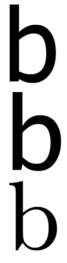
- Select a character, a distinct character
- Make the letter between 200 and 500 pt size
- Draw a grid over the character
- Copy your grid, enlarge your grid onto A3
- Keep it in proportion
- By hand, use your grid and software to draw the typeface e.g. with pen tool, boxes, pencil, line tool
- Identify what makes that typeface distinct
- What makes it different?
- How is it constructed?
- Outcome is to allow and appreciate the subtle differences of typefaces
- Enlarging and hand rendering will give you an appreciation of how it is constructed and what makes it unique and distinct


Frankenstein typeface
Chosen word: silly

Chosen typefaces: Tahoma, Lucida Sans, Baskerville
A:


B:

C:


F:


SILLY TYPE

No comments:
Post a Comment