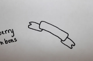
Scanned in hand drawn banner, put into Illustrator to possibly use for label titles.
Use of pen tool to create more of a curve on the text so that it fits in nicely with the shape of the banner.
Space included for ingredients and/or facts.
These don't work all that well...too much blank space and not enough information to fill it. Doesn't really give off enough imagery of the product inside apart from using an appropriate colour.


No comments:
Post a Comment