For my postcard brief I decided to go for the colour orange. During one of my colour theory workshops, we had to the opportunity to go down to photography in order to take some photos of a handful of objects. Unfortunately, when it came to transferring these images onto the computer, the card wouldn't read, and after acquiring help, I was still unable to get my images off.
Because of this, I decided to take some new photographs for this brief. Taking inspiration from the hotdog brief, I wanted to do something that followed on as a theme.
I purchased a bunch of small orange roses that I planned on using. At first, I began by experimenting with flowers in ice, cutting through the middle of them, but this really wasn't going anywhere.
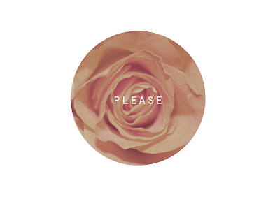
I ended up taking close up photos of each individual flower head, providing me with different tones of orange and different shapes.
Building on what I had learned in photoshop, I used the ellipse tool to cover the main part of the rose head, then created a clipping mask which cropped it to the desired shape. I did this with five different roses, and with each rose I lowered the saturation by 10, in order to get a scale of orange.
Following on from my hotdog theme, I decided to use these postcards as individual poems by Brautigan. Within each different rose was the title of the poem and on the back was the poem itself.
On the reverse of the postcard, I used my new knowledge of photoshop tools, and changed the gradient of the text so that the shade of this also desaturated slightly.
Creating the clipping masks from the main image.
Image cut into a circular shape, which then needs to be flattened.
Aligning the text.
Putting a gradient overlay over the top of the text with chosen colours.
ONE
TWO
THREE
FOUR
FIVE
(Please enlarge)


No comments:
Post a Comment