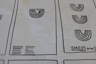
After doing some extra research into rain itself, and also Erik Kessels, I decided to get started on some design sheets.
I wanted to focus mainly on rain imagery, along with possible text. The text on there was going to be the main thing that would attract people to come to the UK. It therefore had to lure people into coming, and spark some kind of emotion.
From this, I decided I wanted to focus mainly on rainbows. There's definitely something special and unique about a rainbow, and it's certainly a product of rain that can be seen as a positive thing. After doing some research, I found a lot of information on something called an upside down rainbow, therefore this might be an interesting way to proceed, or to simply look at the whole 'turn that frown upside down' aspect (it's only a bit of rain!)
I started creating some design ideas that revolved around this notion.
I feel this is quite a fun route to go down, and will catch people's attention - why is the rainbow upside down? I want to keep the design pretty simple, and make it stand out through the use of colour. I don't want to overcomplicate things, a simple statement should do all the talking.


No comments:
Post a Comment