
Showing posts with label batiste. Show all posts
Showing posts with label batiste. Show all posts
Tuesday, 16 April 2013
Wednesday, 20 March 2013
TED BAKER & BATISTE - confirmation of entering
Email confirmations for entering the Ted Baker and Batiste D&AD briefs


Tuesday, 5 March 2013
BATISTE - mid evaluation
Overall, I am happy with my end results in terms of pattern application and overall appearance. I feel that the products reflect the time spent on them, and the pattern has been effectively applied. I am glad that I explored point of sale, as this not only built upon my mocking up skills, but it also gave me the opportunity to get out into the environment and see how the product was currently working within a store. After this research, I felt that my graphic identities would definitely have shelf appeal, and would catch the customer's eye. Each scent had it's own individual personality, which reflected the concept, whilst being trend aware and appealing to Batiste's fashion-led and wide ranging audience.
If I was to develop this brief further, I would explore possible web based deliverables, as well as advertisement. This would strengthen my concept, making it a cohesive whole. I also would have liked to have been able to place my prototypes into an actual shop environment so that I could see how effectively they would have worked. This could have either have been digitally or through print.
If I was to develop this brief further, I would explore possible web based deliverables, as well as advertisement. This would strengthen my concept, making it a cohesive whole. I also would have liked to have been able to place my prototypes into an actual shop environment so that I could see how effectively they would have worked. This could have either have been digitally or through print.
Monday, 4 March 2013
BATISTE - bottle templates
As part of the brief, Batiste wanted to see that your design would work across all three of their existing bottle formats, which were 50ml, 200ml and 400ml. The measurements were given to you, however, it was up to you how you applied your design to these. To begin with, I found this extremely complicated. I couldn't work out in my head how the design would look when laid out flat. It took me a while to figure out where the banner would begin and end and how this would join up with the information on the back. Once I'd finally got a grasp of what I was doing, it became a lot clearer. However, for each bottle size, the process started again and I had to work out how it would all join up. This was very time consuming, and rather mind boggling. Each time, the pattern had to be enlarged, and the information on the back changed to fit the measurements.
Overall, I feel that my pattern works effectively across all three sizes. Although the entire pattern is not visible on the 50ml bottle, you can definitely still see enough for it be effective. The personality and appearance of the individual still comes across well.
Cara
50ml

200ml

400ml

Lana
50ml

200ml

400ml

Florence
50ml

200ml

400ml

Kate
50ml

200ml

400ml

Sunday, 3 March 2013
BATISTE - point of sale development
Final four
Below are my final four bottle prototypes. Overall, I am pleased with how they came out, and feel that the patterns have been an effective way of reflecting four individual personalties. Each scent is unique and therefore allows the customer to purchase the product that suits them. However, i also believe that they will work well next to each other on a shelf environment. The white banner used on existing Batiste products also allows them to work as a cohesive whole in terms of a bigger range of products.


P.O.S
As well as the four graphic identities, the brief also asked for some point of sale. This is something that I had never experimented with before, and I worried slightly that my mock-ups would look unprofessional, I was however quite pleased with my outcomes. Although not the most exciting point of sale, during my research I found that Batiste don't tend to use any form of packaging at all. Generally, the price tag is the only form of P.O.S included.
By including four separate spaces for the bottles, I felt this created more of an exclusive and limited edition "feel". It gave a sort of sense of 'get it before it's gone'. It is also meant that the bottles wouldn't get lost on the shelf, and the pattern could be admired.

Once the box was mocked up, I then began to add colour. I decided to use the colours within each graphic identity so that they worked as a cohesive whole. Although this may seem like too much of the same thing, I feel that it really pushes the identity of each flavour, allowing them to work as a set.

In order to apply my pattern to the point of sale, I had to build it up onto a larger artboard. This was extremely time consuming.

Now that I was a bit more familiar with applying pattern to product, I decided to have a go at defining my own pattern instead of creating clipping masks. This way I could simply fill the shape with the desired image. This was a much simpler way of doing it, and I also found that I could move and drag the pattern around inside the shape, so I could have what I wanted displayed within it.

The next step was to add the Batiste logo. The shape of the point of sale allowed me to fit the logo snuggly inside of the covered top. This made it really stand out and grab people's attentions.

The final step was adding colour to the bottom of the point of sale. Different shades were used in order to create a more realistic effect. I would have liked to have been able to mock up the point of sale with the bottles inside of it, however, I had absolutely no idea how to go about doing this, and really struggled during my attempts to do so.
Applying this process to the rest of the graphic identities


Sunday, 17 February 2013
BATISTE - bottle mock ups
Now that I had my patterns I could go ahead and apply these to the Batiste bottles. As I didn't want to simply creative illustrative versions of the bottles, I decided to find a way of applying these to the actual existing bottles. This way, you are able to see how they would look, without me printing the pattern out and just sticking it to a bottle. This is something I didn't want to do as I felt it would look rather scrappy and not very effective.
For each of the bottles, I traced around the area below the lid, which would become my base for creating a clipping mask. This was then placed on top of the pattern at different areas so that you could see what would be visible at different angles. A clipping mask was then created and placed on top of a stock image of an existing Batiste product.
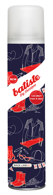
Cara - coconut, fresh & clean


Lana - strawberry, sweet & fruity


Florence - berries, wild & fruity


 Edited version


Kate - vanilla, rich & sweet


For each of the bottles, I traced around the area below the lid, which would become my base for creating a clipping mask. This was then placed on top of the pattern at different areas so that you could see what would be visible at different angles. A clipping mask was then created and placed on top of a stock image of an existing Batiste product.
Cara - coconut, fresh & clean


Bottles showing three different angles of the pattern. I am extremely pleased with how these patterns have applied to the product. I was worried that perhaps the detailed would get lost, or the surface area wouldn't be large enough for me to display a big enough section of my pattern. However, it has worked out extremely well, and believe that this design would attract the attention of the customer within a shopping environment.


Now the pattern had been applied, I could then go ahead and start introducing other elements. I began by creating the main label for the bottle. As Batiste stated they wanted the new bottles to fit in with their existing range, I chose to use the simple banner included on their own designs. We were given the logo within the brief pack, which I then applied to the banner I had created using the pen tool. I experimented with the opacity of this banner, to see whether or not it was worth having the pattern showing through. I feel that full opacity is more effective as it really breaks up the pattern, and makes sure you are aware of the brand.


Next, in a similar style to Batiste's own products, I began to add the scents. The scents I decided to use were chosen by taking the top four scents people chose on the survey I had previously written. I applied each scent to an individual depending on what I felt best suited them as a person. Here, I have made Cara coconut, with the tag line fresh and clean. This was another aspect the brief wanted you to explore. On existing bottles, I felt that the tag lines were extremely cheesy, and did not appeal to their supposed audience. I therefore made them much more simple and relatable. In addition to this, I added a 'new' label, so that the customer is aware that these are the latest scents available, which may make them more inclined to purchase the product. The colour of the labels were determined by the colours used within the pattern, and this process was applied throughout all of the bottle designs.


Edited version


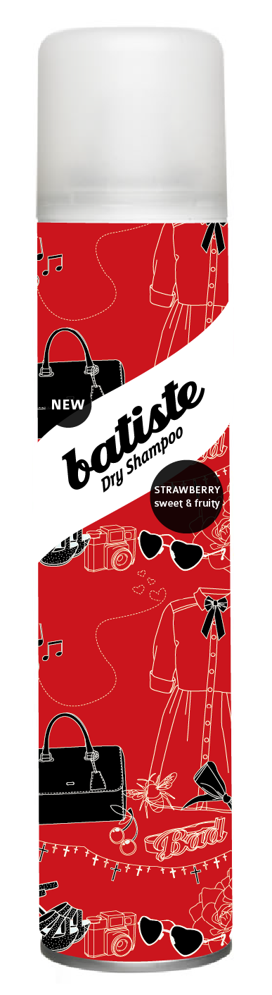

Whilst the same process was followed for all of the bottles, you can see how the product has developed throughout this process. Certain aspects of the pattern were changed during the mocking up of the bottles, and therefore the new pattern needed to be applied. Along with the bottle for Cara, this is my favourite scent. I feel that the overall visuals are extremely effective and would stand out well within a shopping environment. They are the two scents that I imagine selling really well. This may be because I relate more to the illustrations and the individuals.


Edited version


The above bottles went through quite a lengthy process as the pattern was changed on a number of occasions and so was the colour scheme. It is interesting to see how this bottle evolved from the original starting point. By applying the pattern to the bottle at each possible stage, it gave me a better overview of how the final product would look. I could therefore see where changes needed to me made and what needed to be edited. In some cases, certain aspects of the pattern weren't working, and therefore these had to be looked at again and edited to suit the bottle format.
Previously I had been using the colours within my pattern for the labels, however, for this particular bottle, when the cream was applied to the label, I felt that there was too much of a stark contrast and it didn't look cohesive. I therefore made the decision to use a lighter shade of the background colour, which blending in nicely, which also working with the existing colours.


Above, you can see the difference made by simply changing the colour scheme of the product. The light blue bottles are rather sickly and poorly reflect the individual, whereas the darker blue is much more elegant and stands out more. I also feel that the darker blue will work better as part of a set.
Subscribe to:
Posts (Atom)